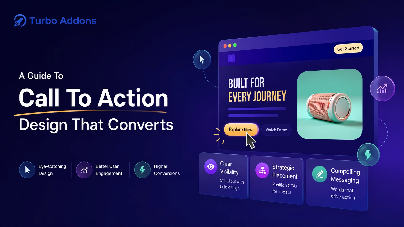
High Converting Elementor CTA Design: Proven Strategies, Real Examples & Easy Implementation with Turbo Addons
Every single visitor that lands on your website has one implicit question: “What should I do next?”
Your answer to that question—delivered through a Call-to-Action (CTA)—determines whether they become a customer, subscriber, or another abandoned session.
But here’s the uncomfortable truth: most CTAs are invisible.
A visitor glances at your page, finds no clear next step, and leaves. No explosion, no dramatic moment—just gone. This silent leak in your funnel costs businesses thousands in lost revenue every month.
The research is clear: a weak CTA costs you money. A strong one prints it. According to HubSpot research, optimized CTAs can increase conversion rates by 161-332%. Yet the difference between them often comes down to small, tactical details. Most WordPress users don’t even know to test these details.
Quick Reference: The CTA Conversion Checklist
Before we dive deep, here’s your quick-reference table for high-converting CTAs:
| CTA Element | What Works Best | Why It Matters | Quick Win |
|---|---|---|---|
| Copy | First-person, benefit-focused | Feels personal and self-directed | Change “Start Trial” → “Start My Free Trial” |
| Color | Highest contrast on page | Must stand out visually | Use a color that appears nowhere else |
| Size | 44×44px minimum on mobile | Large enough to tap easily | Test even larger on primary CTAs |
| Placement | Where intent is highest | Position CTA where visitors expect action | Above fold for simple offers, post-benefits for complex |
| Urgency | Real deadlines/scarcity only | Creates loss aversion psychology | Genuine countdown timers beat fake ones by 300%+ |
| Social Proof | Near the button | Reduces perceived risk of clicking | Add star ratings, customer counts, or testimonials |
| Mobile | Full-width, sticky footer | 63% of traffic is mobile | Test on real devices, not just desktop |
| Singular Focus | One goal per page | Removes decision paralysis | Single CTA can lift conversions 266% vs multiple |
| Testing | One variable at a time | Data beats assumptions | Test copy, then color, then placement—not all at once |
| Friction Reduction | Free trial, guarantees nearby | Lowers barrier to clicking | Money-back guarantee near CTA lifts clicks 20-30% |
What Is a Call-to-Action (CTA) and Why Does It Matter?
A Call-to-Action is any page element that prompts a visitor to take a specific, desired action. It could be:
- A button (“Buy Now,” “Start Free Trial,” “Download Guide”)
- An inline text link (“Learn more about our pricing”)
- A form submission prompt
- A phone number styled prominently
- A chat widget popup
- A clickable image or banner
The CTA is the most important conversion element on your page.
It’s the bridge between passive browsing and active commitment. Without a clear CTA, even perfectly-designed pages fail to convert. Visitors simply don’t know what step to take next.
Why CTAs Matter: The Numbers
The impact of CTA optimization is staggering:
- Using a specific, clear CTA increases conversions by 161% according to HubSpot research
- Personalized CTAs perform 202% better than generic ones per Outbrain data
- CTAs with urgency increase conversions by up to 332% according to Optimonk studies
- Reducing CTAs per page to just one can increase conversions by 266% per WordStream analysis
- Mobile-optimized CTAs improve conversion rates by 32.5% according to mobile optimization research
Your CTA is not a nice-to-have design element. It’s a revenue driver.
The Anatomy of a High-Converting CTA: The Five Core Components
Every effective CTA has five distinct components working in harmony. Miss any one, and conversions suffer.
1. Clear Action Language
Visitors should know exactly what happens when they click. There should be zero ambiguity.
Weak: “Click Here,” “Submit,” “Learn More”
Strong: “Get Instant Access,” “See My Dashboard,” “Download the Free Checklist,” “Start My 30-Day Free Trial”
The stronger CTAs tell visitors both what to do AND what they’ll get. This specificity reduces hesitation.
2. A Clear Value Proposition
The best CTAs don’t just tell you what to do—they tell you what’s in it for you.
Compare these:
- “Sign Up” (what do I get?)
- “Get Free Access to 100+ Elementor Templates” (now I know the value)
The second option makes the visitor’s mental calculation easier: Is this worth my click? With the value stated clearly, many more say yes.
3. Visual Prominence (Design & Contrast)
A beautifully written CTA is useless if it’s invisible. Your CTA must be the most visually distinct element on the page through:
- Color contrast (CTA color ≠ page background color)
- Size (large enough to not be missed)
- White space (surrounded by emptiness so the eye lands on it)
- Styling (shadow, border, gradient—anything that makes it “pop”)
4. Strategic Placement
The best CTA in the world fails if it’s where no one looks. Placement strategy is as important as design.
Placement depends on your offer type, but the principle is simple: place CTAs where intent is highest.
5. Low Friction & Reduced Risk
Visitors hesitate before clicking because they’re subconsciously asking: “Is this safe? What if I waste my time? What if I regret this?”
Reduce that friction through:
- Free trials (try before you buy)
- Money-back guarantees (remove financial risk)
- Social proof (see that others trust this)
- Clear privacy statements (assure them their data is safe)
CTA Copywriting: The Words That Drive Action
The text on your CTA button is small, but its impact is enormous. Here’s what research reveals about copy that converts:
Use First-Person Language
Changing button text from “Start Your Free Trial” to “Start My Free Trial” is a small tweak that generates significant lift.
Why? First-person language feels personal and self-directed. It doesn’t feel like you’re being pushed. It makes the action feel like the visitor’s own decision.
Be Specific and Benefit-Focused
Generic CTAs fail because they communicate no value.
Generic: “Click Here” → Specific: “Get Instant Access to Templates”
Generic: “Learn More” → Specific: “See How Elementor Saves 5+ Hours Weekly”
Keep It Short (2-5 Words Maximum)
Longer CTA text creates cognitive load. When a visitor reads a button, they should understand it in one second—no more.
Use Power Words
Certain words trigger psychological responses and consistently improve CTA performance:
- “Free” – removes financial barrier
- “Instant” – removes time concern
- “Exclusive” – creates scarcity and privilege
- “Now” – creates urgency
- “Proven” – adds credibility
- “Guaranteed” – removes risk
- “Limited” – creates scarcity
Create Genuine Urgency
Urgency works because of a psychological principle: loss aversion. People are more motivated by fear of missing out than by prospect of gain.
Critical caveat: Urgency must be real. Fake countdown timers that reset are noticed by returning visitors. They destroy trust. Only use urgency when it’s genuine.
CTA Design: The Visual Elements That Matter
Color Psychology in CTA Buttons
Research shows that red and orange buttons generate 32-40% higher click rates than other colors in many contexts. But there’s more nuance:
- Red CTA Buttons: Creates urgency, ideal for “Buy Now,” “Limited Offer.” A famous HubSpot test found red buttons increased conversions by 21% over green.
- Orange CTA Buttons: Combines urgency with optimism. Popular for SaaS and creative brands.
- Green CTA Buttons: Signals trust and “go.” Works well for sign-ups and financial platforms.
- Blue CTA Buttons: Most trusted color. Works for B2B, service-based sites.
- Yellow CTA Buttons: Grabs attention. Works best on dark backgrounds.
The Most Important Color Rule: Contrast
Your CTA color must have the highest contrast on the page. A blue button on a blue background is invisible. A bright orange button on dark gray stands out immediately.
Button Size & Shape
- Mobile minimum: 44×44 pixels (recommended tap target size)
- Primary CTA: Often works best at 50-60px height
- Button Shape: Rounded corners feel friendlier, sharp corners feel formal.
White Space: The Underrated Power Tool
White space (empty space) surrounding your CTA is incredibly powerful. It draws the eye to the CTA. It also prevents the button from getting lost in visual noise.
CTA Placement: Where You Put It Is As Important As What It Says
Above the Fold (First Screen)
Placing a CTA above the fold is the most widely recommended starting point for simple, low-friction offers.
Below the Fold & Mid-Page (After Benefits)
For complex products or services, placing the CTA mid-page (after benefits section) works better. Visitors need to understand value first.
Repeating CTAs on Longer Pages
For long-form pages, repeat your CTA at key intervals: hero section, after benefits, and at the end. All should point to the same goal.
Sticky/Floating CTAs
A sticky CTA stays fixed on the screen as visitors scroll. It is particularly effective on mobile.
Inline CTAs in Blog Posts & Content
Research shows inline link CTAs perform 121% better than standard sidebar CTAs. Readers are most engaged when mid-article.
Mobile CTA Optimization: Non-Negotiable in 2026
Over 63% of web traffic now comes from mobile devices. Mobile is the primary use case now.
Mobile CTA Best Practices
- Thumb-Friendly Button Sizes: Minimum 44×44 pixels (larger for primary CTAs)
- Mobile-First Placement: CTA visible on first screen load without scrolling
- Full-Width Buttons: Easier to tap, create visual prominence
- Sticky Mobile Footer: CTA stays accessible while scrolling
- Collapse Secondary Elements: One page = one clear goal
Optimizing CTAs for mobile can improve conversion rates by 32.5%. That’s a significant lift from straightforward adjustments.
Using Urgency & Social Proof to Amplify CTA Performance
Creating Genuine Urgency
Urgency works through loss aversion. People are more motivated by fear of missing out than by prospect of gain.
Effective urgency tactics:
- Countdown timers for limited-time offers
- Limited stock/seat messaging: “Only 4 spots left”
- Time-bound language: “Today only,” “Offer ends Friday”
- Event-based urgency: “Workshop starts in 2 weeks”
Using Social Proof Near CTAs
Social proof placed near your CTA reduces perceived risk. Pop-ups with strong social proof had average conversion rates of 42.3%. Nearly half of viewers completed the desired action.
Effective social proof elements:
- Customer counts: “Trusted by 500,000+ users”
- Star ratings: 4.8/5 stars badge
- Short testimonials: One-line customer quote
- Logo bars: “As featured in Forbes, TechCrunch, Wired”
A/B Testing Your CTAs: The Only Way to Know What Works
Your specific audience is unique. A/B testing is the only reliable way to discover what genuinely drives conversions for your visitors.
How A/B Testing Works
Create two versions of a CTA (changing one variable) and split traffic between them to measure which performs better.
The critical rule: Change only one thing per test.
Variables Worth Testing
- Copy tests: “Get Started” vs. “Start My Free Trial”
- Color tests: Red vs. orange vs. green
- Placement tests: Above fold vs. below vs. after testimonials
- Size tests: Standard button vs. oversized
- Context tests: With social proof vs. without
How to Build High-Converting CTAs with Turbo Addons for Elementor
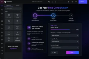
Turbo Addons for Elementor is a free plugin with 90+ professional widgets for WordPress users. The Turbo Addons Call-to-Action widget is purpose-built for creating high-converting CTAs without coding.
The Turbo Addons Call-to-Action Widget Features
Content Options:
- Custom headline (h1-h6 tags)
- Descriptive subtitle/body text
- Background image or color
- Multiple layout variations
Primary CTA Button:
- Custom button text
- Destination URL
- Button styling (color, size, border, shadow)
- Hover effects and animations
Secondary Button (Optional):
- For two-option CTAs (e.g., “Start Free Trial” + “See Pricing”)
- Styled independently from primary CTA
Complete Visual Control:
- Container padding, margins, borders
- Title and body text color & typography
- Button colors, hover states, animations
- Responsive adjustments for mobile
Step-by-Step: Building a High-Converting CTA with Turbo Addons
- Install Turbo Addons – Download from turbo-addons.com or search in WordPress plugins
- Add CTA Widget – In Elementor editor, search for “Call to Action” widget
- Write Your Copy – Headline (benefit-focused), description (value), button text (first-person, specific)
- Style the Button – Choose contrasting color, set size, add shadow/hover effect
- Position on Page – Above fold for simple offers, mid-page for complex ones
- Test on Mobile – Preview on actual mobile device
- Publish and Monitor – Track performance, identify improvements
Amplifying Turbo Addons CTA Widget with Other Widgets
Turbo Addons’ 90+ widgets work together to amplify CTA performance:
- Use Turbo Addons Countdown Widget with CTA: Countdown Timer widget creates genuine urgency above or below CTA.
- Use Turbo Addons Testimonial Widget with CTA: Testimonial Slider widget placed before CTA provides social proof.
- Use Turbo Addons Info Box Widget: Info Box widget highlights benefits before CTA.
- Use Turbo Addons Counter Widget: Counter widget showing customer count near CTA.
Common CTA Mistakes to Avoid
- Too Many CTAs on One Page: Research shows that reducing CTAs to a single primary action increases conversions by 266%.
- Vague Button Text: “Submit,” “Click Here,” and “Learn More” communicate nothing about value.
- Poor Color Contrast: A CTA button that blends into the page background is invisible. Choose a button color that appears nowhere else on the page.
- No Mobile Testing: Designing on desktop without testing on mobile leads to tiny tap targets and off-screen buttons.
- Ignoring Context: Everything around your CTA matters: headline, social proof, competing elements. Design the entire section around the CTA.
- Fake Urgency: Countdown timers that reset, “only 2 left” messages that never change—visitors notice and stop trusting you.
- Not Testing: Assumptions are not data. A/B testing is the only way to know what works for your audience.
Frequently Asked Questions About CTA Design
What is the ideal CTA button size?
The absolute minimum is 44×44 pixels. For primary CTAs, 50-60px height often converts better. Test larger buttons—many sites find oversizing improves conversions by 10-20%.
How many words should a CTA button have?
Keep it to 2-5 words maximum. Put supporting information in copy above/below the button.
Which CTA color converts best?
Contrast matters most. Your CTA should be the most visually distinct element on the page. Red and orange consistently generate 32-40% higher click rates in many contexts.
Where’s the best place to put a CTA on a page?
Simple offers work above the fold. Complex products need explanation first—place CTA after benefits section. Long pages benefit from repeated CTAs at key intervals.
Should I use one CTA or multiple CTAs per page?
Use one primary CTA goal per page. A single CTA can increase conversions by 266% vs. multiple competing CTAs.
How do I optimize CTAs for mobile?
Use full-width buttons, ensure CTA is visible on first screen load, maintain 44×44px minimum tap target size, test on actual mobile devices.
How often should I A/B test CTAs?
Ongoing. After establishing a high-performing Elementor CTA design, keep testing incremental improvements. Most sites find continuous CTA testing generates 5-15% conversion lifts quarterly.
Is urgency language effective?
Yes, but only if genuine. Real urgency increases conversions by up to 332%. Fake urgency destroys trust.
Should CTAs have animations?
Subtle animations (hover effects, gentle scale changes) can draw attention without being intrusive. Turbo Addons CTA widget includes animation options you can customize to your brand.
The Bottom Line: High-Converting CTAs Are Built, Not Discovered
High Converting Elementor CTA design isn’t about finding a magic button color or a single power word. It’s about understanding your audience, communicating clear value, and removing friction through deliberate design and psychological principle.
For WordPress users building with Elementor, Turbo Addons removes technical barriers between strategy and implementation. The Call-to-Action widget, combined with other purpose-built widgets for social proof and urgency, lets you implement everything in this guide without touching a line of code.
Your Next Steps
- Audit your current CTAs – Do they meet the five core components?
- Implement changes – Using Turbo Addons CTA widget, rebuild your most important CTA
- Test mobile – Preview on actual mobile devices
- Establish baseline – Measure current CTA performance
- A/B test – Change one variable and measure impact
- Iterate – Implement winners, test next variable, repeat quarterly
Resources for Further Learning
CTA Design & Optimization:
- HubSpot Call-to-Action Guide
- WordStream CTA Best Practices
- Optimonk CTA Research
Turbo Addons Resources:
- Turbo Addons Official Site
- Turbo Addons CTA Widget Demo
- All 90+ Turbo Addons Widgets
- Turbo Addons Documentation
Color Psychology:
- Color Theory for Web Design
- Color Psychology & Conversion Rates
Mobile Optimization:
- Perfect Mobile Button Size
- Mobile Traffic Statistics 2026
Last updated: July 2026
Have you tested CTAs on your Elementor site? What changes had the biggest impact on your conversion rates? Share your experience in the comments below.
Featured image: https://turbo-addons.com/wp-content/uploads/2026/07/how-to-create-high-convert-call-to-action-.webp